
Signal & Stock
Context
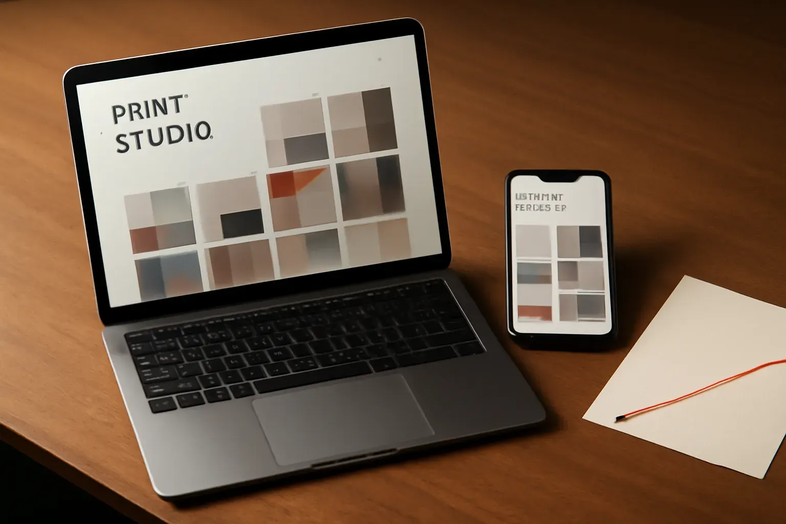
A concept brief for an independent print studio with a small, specific catalogue — risograph prints and short-run stationery — and no site beyond a single social profile. The brief we set ourselves: build a site that reads as considered as the product itself.
Approach
We started from the catalogue, not a template — a small number of pieces, each worth showing properly rather than crammed into a grid. The navigation follows how a buyer actually browses a print studio’s work: by piece, not by category filter. Typography carries most of the visual weight, in keeping with a print-led brand.
What we made
- Homepage
- Catalogue index
- Individual piece pages
- An about/process page
- A simple enquiry form
Outcome
As a studio concept, this project demonstrates our approach to small-catalogue design — dense, specific, and led by the product rather than a generic e-commerce pattern. It has not been built or launched for a real client.